
On November 24, 2025, the Office of the Ombudsman and Africa Uncensored received a response dated 21st November from Kenya’s Social Health Authority (SHA) to a Freedom of Information Act (FOIA) request. Africa Uncensored had submitted the request on August 4, 2025, seeking clarity on SHA’s means-testing system and the criteria used to determine monthly premiums for Kenyans in the informal sector ahead of publishing the documentary ErrorByDesign.
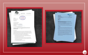
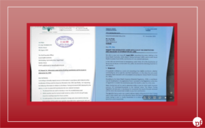
Screengrab of FOIA request and Reply from SHA
Two weeks later, on December 8th, the hashtag #SHAAt28Million with the phrase “means testing” was trending on X. Between 10:57 UTC and 23:36 UTC (a span of 12.6 hours) 871 tweets were captured from 158 unique accounts (dataset). Of these, 465 were reposts (53.4%) while 406 were original posts or replies (46.6%). The activity showed unusually high amplification patterns, with repost-driven engagement dominating the conversation. The trend displayed several overlapping indicators commonly associated with coordinated and inauthentic amplification rather than organic public discourse.
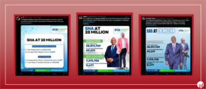
Piga Firimbi investigated the accounts, comments, reposts, and posts driving the narrative on X and found evidence suggesting a highly coordinated campaign bearing the hallmarks of an influence operation, likely aimed at diverting public attention from the substantive concerns raised about SHA’s means-testing system.
Kenya’s Health System
The Social Health Authority uses proxy means testing (PMT) to estimate income for people in the informal sector, who make up nearly 80% of Kenya’s workforce and often lack formal income records. Households are required to contribute 2.75% of their income to the Social Health Insurance Fund (SHIF). While salaried employees have the amount deducted directly from their wages, non-salaried workers are assessed through an algorithmic model that predicts household welfare using more than 43 variables derived from several questions asked during registration. These include housing material, ownership of assets such as bicycles or refrigerators, education level, household size, access to electricity and sanitation, employment status, geographic location among others.
The model, built using data from the 2021 Kenyan Continuous Household Survey covering about 17,000 households, applies regression to estimate per-capita consumption, which is then used as a proxy for income and used to calculate premiums. Households assessed at Ksh 300 or below pay a base premium of KSh 300 and may qualify for subsidies, while those estimated above that threshold pay the full calculated contribution without government support. Citizens can access the means-testing process through the Afya Yangu portal by declaring themselves self-employed and some answering a series of socio-economic questions.
However, investigative findings by Africa Uncensored, Lighthouse Reports and Guardian have raised concerns about the fairness and accuracy of the model, showing that it tends to overestimate the income of poorest households while underestimating that of wealthiest ones. In the documentary ErrorbyDesign nearly 80% of the poorest households are likely charged more than they should be, while over 60% of the wealthiest households would contribute less than expected. Critics also had noted high exclusion error rates, especially among vulnerable households with access to electricity, education, or those living in relatively affluent counties. Although the model demonstrates moderate predictive accuracy overall, its limitations at the extremes of the income distribution have fueled concerns about inequity in the implementation of universal health coverage financing in Kenya.
Means testing directly assesses a household’s income or consumption to determine eligibility or contribution levels. Proxy means testing (PMT) estimates income/consumption when direct data is unavailable, using observable household characteristics that correlate with economic status
DEFLECTION & TIMELINE ANALYSIS
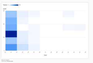
The hashtag #SHAAt28Million AND means testing campaign followed a classic astroturfing curve of a low morning start to massive midday burst to sustained afternoon tail. Organic discussions of government health programs typically spread across multiple days with gradual growth curves, not single-day explosive spikes.
The Twitter campaign’s peak burst at 12:25 UTC occurred less than 3 weeks after SHA’s reply, consistent with a reactive, coordinated counter-narrative operation timed to flood the information space with positive SHA/Taifacare content on the same day as the critical inquiry was made. The evidence includes synchronized posting bursts, near-identical copy-pasted content replicated up to 28 times, a small cluster of “seed” accounts whose messages were mass-amplified within narrow time windows, a heavy concentration of newly created accounts, and near-total absence of critical or negative sentiment.
Bubble chart showing overall sentiments in the data set.
All tweets combine #SHAAt28Million with “means testing” and often “Taifacare” a precise, coordinated hashtag strategy. The hashtag #SHAAt28Million itself appears to be a campaign-created hashtag designed to flood search results and trend organically.
METHODOLOGY
We used a data set of 872 tweets captured from 9th Dec 2025 to 10th Dec 2025.
TIMELINE ANALYSIS
1.1 Posting Concentration
The campaign was compressed into approximately 13 hours. The most dramatic finding is the extreme burst at 12:25–12:35 UTC:
Chronological Activity Log
| 5- Minute window | Tweet Volume | Activity Phase |
| 11:55 | 52 | Morning escalation |
| 12:15 | 38 | Build-up phase |
| 12:25 | 94 | Pre-peak surge (Immediately before peak) |
| 12:30 | 120 | Peak burst (9.5% of all tweets in 5 min) |
| 12:35 | 48 | Immediate post-peak retraction |
Chronological Narrative
- 11:55 – Morning Escalation: 52 tweets. The initial uptick began here, setting the baseline for the subsequent surge.
- 12:15 – Build-up Phase: 38 tweets. While volume decreased slightly, this period marked the final consolidation before the peak.
- 12:25 – Pre-Peak Surge: 94 tweets. Volume increased by nearly 150% in just ten minutes, signaling an imminent burst.
- 12:30 – Peak Burst: 120 tweets. This 5-minute window accounted for 9.5% of all daily tweet activity.
- 12:35 – Post-Peak Retraction: 48 tweets. Activity levels returned to near-morning escalation levels immediately following the burst.
A total of ~214 tweets in just 10 minutes (12:25–12:35 UTC). This level of burst posting is inconsistent with normal organic engagement. For 214 tweets to occur in 10 minutes from independent users, each of the 158 unique accounts would need to be posting simultaneously, which is statistically implausible without coordination.
Heat map showing the chronological activity from 10:55am- 22:35am
1.2 Synchronized Posting Windows
A synchronized posting analysis reveals multiple instances where many different accounts posted within the same narrow time window:
- 12:25–12:35 UTC: 214 tweets from what appear to be many different accounts, in just 10 minutes
- Multiple 5-minute windows exceed 38+ tweets — unusual for a campaign involving 158 accounts unless coordinated
- Inter-tweet median interval: only ~17 seconds during peak windows
Truly organic Twitter engagement from independent users produces a Poisson-distributed posting pattern with much longer median gaps. Sub-minute median intervals across campaign windows are inconsistent with organic behavior.
Accounts race showing coordinated posting from 10:45 a.m -16:30 p.m
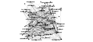
Network diagram showing co-timing of accounts posting / Source : Gephi
2. Seed Account Amplification Network
The campaign operates through a clearly identifiable two-tier structure:
Tier 1 — “Seed” Accounts (original posters): A small group of accounts posted the original campaign messages.
Tier 2 — “Amplifier” Accounts (retweeters): A larger group of accounts rapidly retweeted the seed content.
| Seed Account | Times Amplified | Amplification Pattern |
| @Bristol_254 | 33 | Concentrated burst |
| @cosmochoy | 45 (rt_count includes original tweets) | Most-repeated individual message (28×) |
| @punny_biz | 25 | Coordinated amplification |
| @SeyMonicah | 22 | Cross-cluster amplification |
| @IsajiBrian1 | 21 | Coordinated amplification |
| @Ruto_nated | 19 | Pro-government aligned |
| @_EvelynKe | 19 | Coordinated amplification |
| @naledifusion | 19 | Coordinated amplification |
| @ke_johnnieh | 18 | Coordinated amplification |
| @Shaccari254 | 17 | Coordinated amplification |
Bubble chart showing seed accounts and amplifier accounts
Key observation: Account names like “Ruto Stan!”, “Ruto_nated”, “UDA Documentation“, “Didmus Barasa Commentary”, “Speaker Wetangula Commentary”, and “Kenya Kwanza Commentary” explicitly align with the ruling UDA/Kenya Kwanza political coalition, suggesting the CIB campaign has political/government affiliations
2.2 STRUCTURAL FINDINGS: THE OPERATION’S ARCHITECTURE
Based on the data, the probable structure of this CIB campaign is:
COORDINATION LAYER (unknown orchestrator)
│
▼
SEED ACCOUNTS (~20 accounts)
@bristol_254, @cosmochoy, @punny_biz, @SeyMonicah,
@IsajiBrian1, @Ruto_nated, @_EvelynKe, @naledifusion,
@ke_johnnieh, @Shaccari254, @KKCommetary, @Motiryot_…
│
│ Post pre-written template messages
▼
AMPLIFIER ACCOUNTS (~140 accounts)
“Didmus Barasa Commentary”, “Ruto Stan!”,
“Speaker Wetangula Commentary”, “UDA Documentation”…
│
│ Rapid retweet within narrow time windows
▼
HASHTAG TRENDING TARGET
#SHAAt28Million → Trend → Counter FOIA narrative
Network diagram of seed and amplifier accounts for #SHAAt28Million AND means testing
3. FAKE ACCOUNT INDICATORS
3.1 Account Profile Flags
The accounts in the data set- to be in word
| Indicator | Count | % of Unique Accounts |
| No Profile Bio | 31 | 19.6% |
| Low Followers (<200) | 35 | 22.2% |
| Hyperactive (≥10 tweets/day) | 10 | 6.3% |
| High Retweet Rate (≥80%) | Multiple | — |
| Following > Followers | Significant | — |
| Not Verified | 142 | 89.9% |
| Followers < 10 | 4 | 2.5% |
3.2 Notably Suspicious Individual Accounts
| Account | Tweets | Followers | Red Flags |
| Didmus Barasa Commentary 🇰🇪 @khadija34020960 |
48 | 819 | 48 tweets in 1 day; political commentary account |
| Ruto Stan! @ruto_nated |
34 | 9,035 | “Stan” account explicitly dedicated to ruling party |
| Speaker Wetangula Commentary @kijanayabukembe |
32 | 354 | Fake commentary on serving politician; only 354 followers |
| Rolex Rono Kirwogin. @rolexrono |
30 | 1,488 | 30 tweets/day |
| Punny Business @punny_biz |
19 | 9,868 | No bio; high follower count despite no bio |
| Ebony Ella @ebonyella372786 |
6 | 91 | Very low followers; no bio; created 2024–2025 |
| Robin Man | 8 | 3 | Only 3 followers; created 2024–2025 |
| Viny Ke @vinyke356100 |
8 | 73 | Very low followers; new account |
| Cyancutie🥰 @cyntty001 |
7 | 86 | Low followers; new account |
3.3 Account Age Analysis
Using Twitter numerical ID ranges as a proxy for account creation dates:
| Creation Period | Unique Accounts | % |
| 2024–2025 (very new) | 35 | 22.2% |
| 2023 | 44 | 27.8% |
| 2020–2022 | 50 | 31.6% |
| 2013–2019 | 25 | 15.8% |
| Pre-2013 | 4 | 2.5% |
| Total | 158 | 100.0% |
50% of participating accounts were created in 2023 or later. This is a significant red flag: a disproportionate number of very new or recently-created accounts participating in a single-day coordinated campaign is a classic CIB indicator.
4. COORDINATED INAUTHENTIC BEHAVIOR PATTERNS
4.1 Content Duplication
The most damning evidence of CIB is the systematic use of identical/near-identical copy-pasted content:
| Metric | Value |
| Total tweets | 871 |
| Tweets with duplicated content | 743 |
| % of tweets with duplicate content | 85.3% |
| Unique content groups where same text was repeated | 153 |
| Single message repeated most times | 28× (identical) |
Most-repeated messages (verbatim copy-paste, multiple accounts):
- [28×] “Milestone unlocked! SHA surges to 28 MILLION registrations via Afyangu portal! 28,011,729 Kenyans strong, with ~29K daily…” — @cosmochoy
- [19×] “Kenya strengthens SHA adoption with 28,011,729 registrations as Taifa care investments deepen. Means testing reaches 7,319,758…”
- [18×] “Huge win for Kenyan health! SHA hits 28 MILLION registrations! 28,011,729 strong & growing with ~29K daily…”
- [15×] “A modern system. A reliable process. A healthier country. Kenya is moving with confidence…”
- [14×] “Kenyans continue showing strong interest in SHA information sessions…”
- [13×] “SHA’s structured means testing ensures Taifa Care benefits genuinely reach households requiring assistance…”
- [11×] “With 29,000 daily registrations, Kenyans are signaling confidence in Taifa Care…”
- [11×] “SHA’s Means Testing Report shows millions of Kenyans are now properly assessed…”
Organic individuals expressing genuine opinions about healthcare policy do not independently compose identical word-for-word tweets. This pattern is consistent with accounts receiving pre-written message scripts (“tweet templates”) from a coordinating party, or a single operator running multiple accounts.
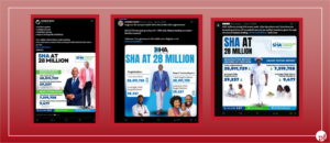
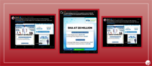
Screengrab of the identical repeated messages during the campaign
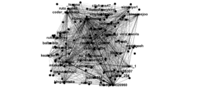
Network Analysis showing
4.2 Narrative Templates
All campaign content follows a set of pre-approved talking points:
- “28 million registrations” milestone celebration
- “7.3 million means-tested members” statistic promotion
- “29,000–40,000 daily registrations” momentum narrative
- “Taifacare is working” / “Taifa care” branding reinforcement
- SHA means testing as a positive equity mechanism
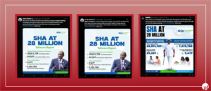
Screengrab of Narrative templates used during the campaign.
Bubble chart showing narratives used during the #SHAMeansTesting campaign
These talking points are consistent with official government/SHA communications, suggesting the campaign may have been organized with coordination from official sources, or by political operatives aligned with the ruling party.
4.3 Political Naming Pattern of Accounts
A striking pattern in account names and bios reveals the campaign’s political character:
- “UDA Documentation & News @Williamruto supporter”
- “Ruto Stan!”
- “Didmus Barasa Commentary 🇰🇪” (Didmus Barasa is a senior UDA MP)
- “Speaker Wetangula Commentary” (Moses Wetangula is Speaker of the National Assembly, UDA alliance)
- “Kenya Kwanza Commentary 🇰🇪” (Kenya Kwanza is the ruling coalition)
- “The Dawn 🇰🇪🇱🇷” “Political analyst, Online Influencer”
These accounts form a visible network of pro-government amplifiers that participated simultaneously in the campaign.
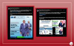
Multiple posts with hashtag SHAmeans testing shared by Kenya Kwanza Commentary
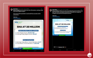
Multiple posts shared by Ruto stan with the hashtag SHAmeans testing
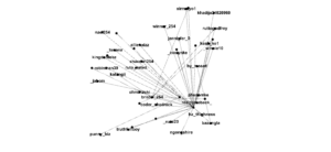
Network graph showing co-content duplication
5. Language Pattern — English Only Despite Kenyan Campaign
A genuine grassroots Kenyan healthcare discussion would include significant Kiswahili content not English 871 tweets (100%).The absence of Kiswahili is consistent with accounts operating from a shared English-language script, possibly managed by a centralized operation or content farm.
6. GEOGRAPHIC ANOMALIES
| Country | Tweets | % |
| Kenya | 424 | 48.7% |
| Unknown | 291 | 33.4% |
| United States | 53 | 6.1% |
| Uganda | 21 | 2.4% |
| Belgium | 15 | 1.7% |
| Austria | 14 | 1.6% |
33.4% of tweets have unknown/unverifiable origin. A further 7.7% come from outside Africa entirely (US, Belgium, Austria, Cyprus, Guernsey). For a campaign ostensibly about Kenyan healthcare, significant activity from Europe and North America warrants scrutiny — this pattern is consistent with either VPN use to mask true locations, or diaspora account farm operations.
7. COORDINATION SIGNAL MATRIX
| Signal | Observed | Significance |
| Exact duplicate content (>1x) | 85.3% of tweets | 🔴 CRITICAL |
| Single-day campaign burst | All 871 tweets in 13 hours | 🔴 CRITICAL |
| 214 tweets in 10-minute window | 12:25–12:35 UTC | 🔴 CRITICAL |
| Near-zero negative sentiment (0.23) | vs. expected 15–30%+ | 🔴 CRITICAL |
| Pre-written template narratives | Identical text across accounts | 🔴 CRITICAL |
| 50% accounts created 2023–2025 | New accounts for a 1-day campaign | 🟠 HIGH |
| Political naming pattern | UDA/Kenya Kwanza aligned names | 🟠 HIGH |
| No Kiswahili in Kenyan campaign | 100% English-only | 🟠 HIGH |
| 31 accounts with no bio (19.6%) | Typical bot/fake ratio | 🟠 HIGH |
| 22.2% accounts with < 200 followers | Low-reach amplifiers | 🟠 HIGH |
| Timed to FOIA filing date | Campaign = response to inquiry | 🟡 MEDIUM |
| 33.4% unknown geographic origin | VPN/non-Kenyan accounts | 🟡 MEDIUM |
| 98.2% unverified accounts | Near-total lack of verified voices | 🟡 MEDIUM |
ERROR BY DESIGN BACKLASH: HOW SHA DEFENDED ITS CONTROVERSIAL MEANS TESTING ALGORITHM”
Africa Uncensored’s documentary ERROR BY DESIGN examines major weaknesses in Social Health Authority’s AI-driven means testing system, arguing that the model systematically misjudges the economic realities of millions of Kenyans and results in fair health insurance contributions. According to Lighthouse Reports’ methodology, the investigation dives into how a machine learning model is being used to set the health insurance premiums of millions of Kenyans. By obtaining the training data and variables, we were able to reconstruct the model in order to test its effectiveness and how it would calculate premiums for different kinds of people.
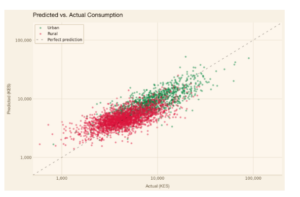
Flourish chart showing the Prediction of Urban versus Rural
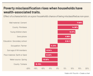
Flourish chart illustrating patterns of poverty misclassification by the SHA means-testing algorithm.
The investigation revealed substantial inaccuracies in the proxy means testing algorithm. It correctly predicted consumption for just 16 percent of the poorest households, while overestimating consumption for 80 percent of them. Among wealthier households, the model performed somewhat better but still underestimated consumption levels for more than 60 percent of households, raising concerns about the fairness of the assessment system.
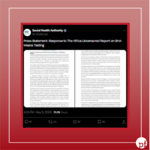
Screengrab of Social Health Authority response to Error By Design.
In response, the Social Health Authority on X defended the new model as a necessary reform of the former NHIF contribution structure, which it says disproportionately burdened low-income earners. According to SHA, the previous system required some of the poorest contributors to pay up to 5% of their income, while higher earners contributed as little as 1.12%. The agency maintains that proxy means testing is an internationally recognized approach used in countries such as Colombia and Indonesia, and says the current framework was designed using nationally representative data from approximately 17,000 households to minimize exclusion and inclusion errors. SHA also argues that most households in the informal sector are grouped into lower contribution bands, with safeguards intended to cushion families from inflated estimates. While acknowledging that “no data system is flawless,” the authority says changing household conditions, including job loss, fluctuating income, or the death of a breadwinner, make periodic inaccuracies unavoidable.
At the center of this debate is whether SHA’s appeals and review mechanisms are sufficient to correct the documented inaccuracies. The agency says more than half of formal sector workers experienced reduced premiums under the revised structure and has pledged to strengthen the appeals process through shorter review timelines and Alternative Dispute Resolution mechanisms.
Screengrab of Africa Uncensored’s reply
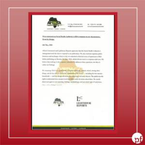
In a follow-up statement issued after SHA responded to the investigation, Africa Uncensored argued that the Authority had not substantively addressed several questions submitted before publication, particularly regarding the fairness of the means-testing model and the design choices that shaped its outcomes. Africa Uncensored maintained that concerns about the model’s impact on low-income households remained unresolved, fuelling further public debate over whether the system protects vulnerable Kenyans or risks unfairly burdening them.
METHODOLOGY
The dataset analysed for this investigation comprises 871 records scraped from X using hashtag #SHAAt28Million and “means testing” The data spans 9th Dec 2025 to 10th Dec 2025 and includes metadata on content type, author handle, posting time, hashtags, engagement metrics (likes, reposts, replies, views), geographic tags, and text content.
Limitations should be noted: the dataset reflects a hashtag-filtered collection, not a full platform capture. Account creation dates, follower counts, and verification status were unavailable, constraining the ability to identify newly created or bot-like accounts with certainty.
Follow Africa Uncensored’s WhatsApp Channel for verified facts and updates on what’s happening online.
This article was produced with research by Moffin Njoroge of Code for Africa’s iLab.


Add comment